Hi guys! I've had some inquiries about how I made the new header for my blog. So I decided to do a tutorial. I'll show you how I made mine, but you can use the same basic steps to create your own, personalized header for your blog.

This is my first tutorial, so hopefully it's not too hard to follow.
I am using Photoshop CS5, but I believe you can basically do the same thing using Gimp {it's like Photoshop, but it's free!}
{Click on any image to see it larger}
First things first. You need to know how wide to make your header. I am using the Simple Template for my blog. The easiest way to see what size your layout is is this:
1. Go to 'Template Designer' in the 'Design' section of your blog.
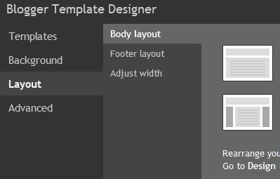
2. Go to 'Layout' and then 'Adjust Width'. From there you will see this:
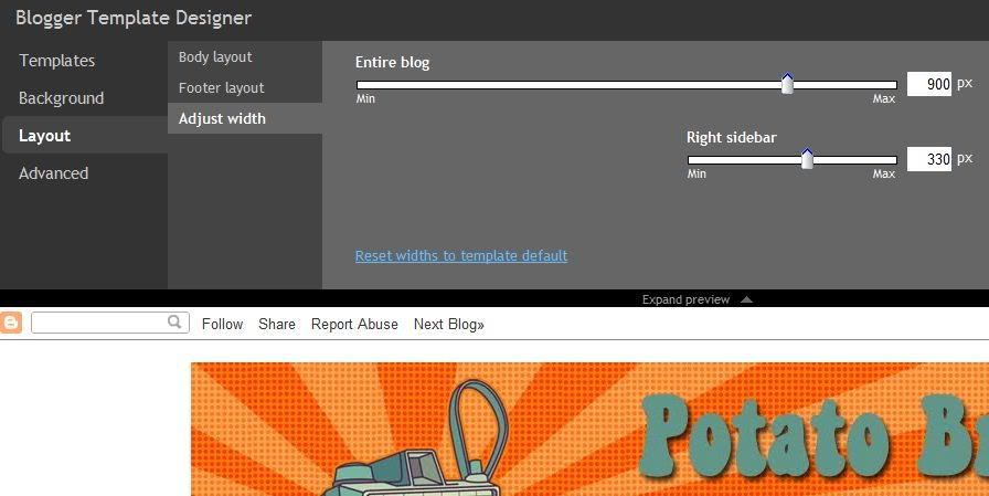
Mine says 900px, so I know I want my header to be 900px wide.
If you are using the Minima template you can find the width by doing this:
1. Go to 'Edit HTML' in your blog design and look for this: #header-wrapper . *hint: to find this easily hit Ctrl F and enter #header-wrapper and it will find it for you so you don't get lost in all that HTML*
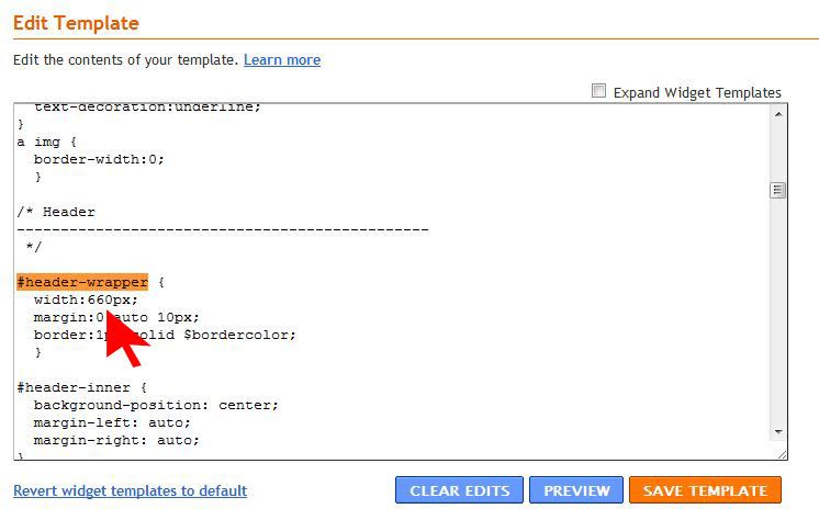
You can see the width on the Minima template is 660px {default size}
Now you have the correct width, you can make it any height you like. {I made mine 900px by 300px}
Enough of that boring stuff, on with the fun!
Open a 'New File' in Photoshop just like this, but with the width and height of your choice.
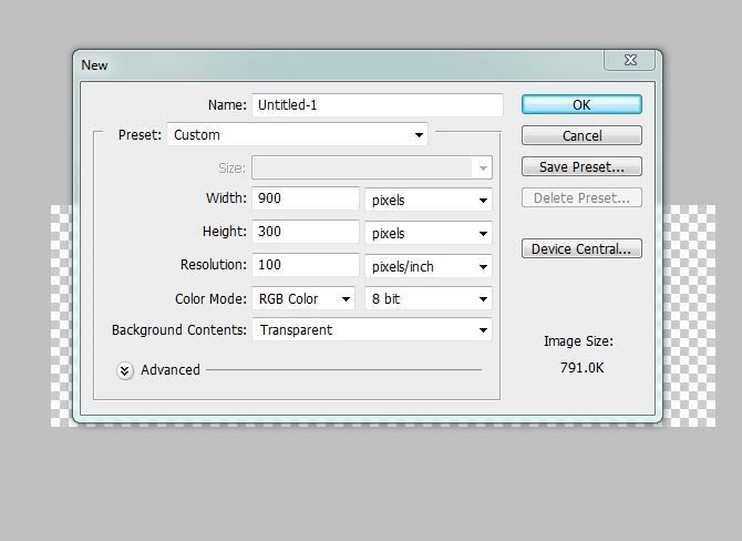
I like to work with a Transparent background in case I don't fill everything in and I want to be able to see through it, to my blog background. Like this:
Now that we have our new file ready to go it's time to make it pretty. I had an idea of what I wanted my header to look like. I wanted it to have a retro feel to go along with the camera cut out I wanted to use. And I wanted the rising sun lines and comic book-like dots to make it even more retro.
My camera cut out came from http://www.jessicasprague.com/. They have an awesome selection of digital scrap booking kits. The camera is from the Kitschy Digitals Vintage Cameras Kit {$4.99}.
The two fonts I used are from www.dafont.com. They have tons of fonts that are FREE for personal use.
Let's get to it, shall we?
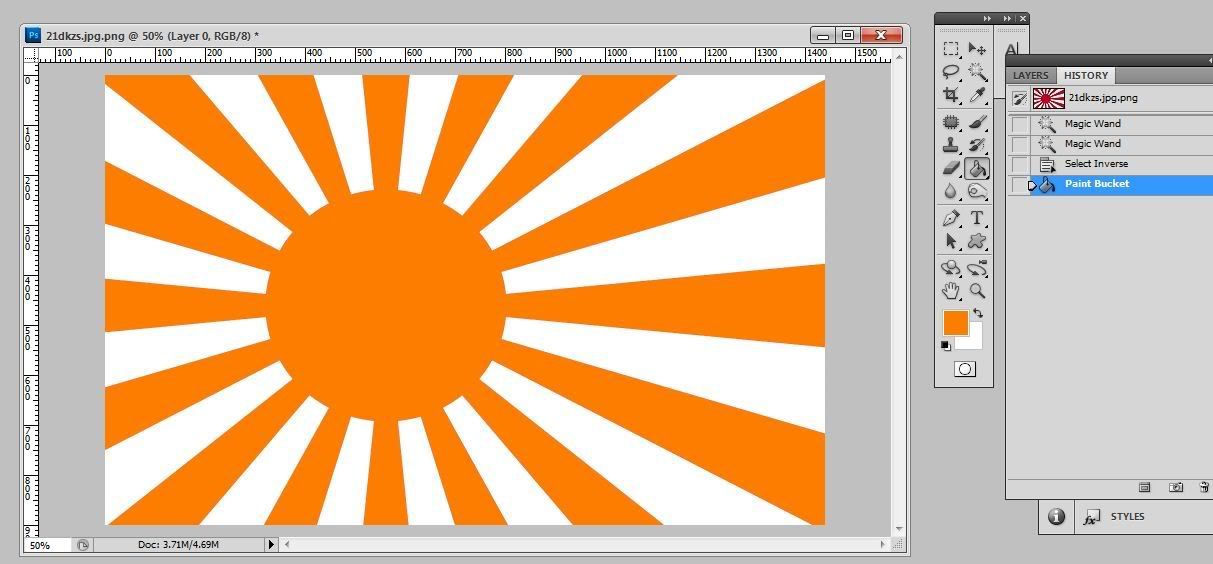
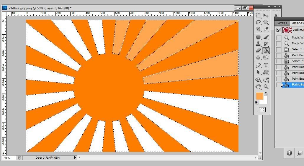
First I made the rising sun background using this picture:

I tweaked it a little to make the circle smaller and I changed the colors using the 'Paint Bucket' tool:
then I re-sized the image to make it fit better on my header: Go to Image > Image Size...
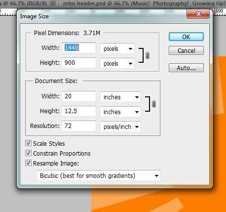
Make sure 'Constrain Proportions' is checked and just change the width to the same as your header. This just makes it easier to work with once you paste it onto your header.
Now that you've changed the image size hit Ctrl A to 'Select All' and the hit Ctrl C to 'Copy'.
Go to the new file you made for your header and hit Ctrl V to 'Paste' it on there.
You can move it around/re-size it so it is where you want it to be.
Use those same steps for any other images you would like to add to your header.
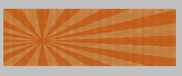
Time to add the comic book-like dots. I used this image I found online:
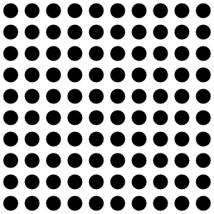
It is a .png file which basically means that all you get are the dots and NOT the white background so we don't have to go through the trouble of cutting out all those dots. I 'Pasted' them on top of the the rising sun layer, then re-sized them to my liking and copied that layer {just drag the layer you want to copy down to the new layer icon}...
Once you have all your copied layers where you want them, you can ''Merge' them together so you'll just have 1 layer of dots instead of a whole bunch. To do this, first 'Turn Off' any layers you want separate from the dots {by clicking the eye on the left of the layer so you can't see it} The only layers showing should be your Dots layers. Make sure one of them is highlighted and hit Ctrl>Shift>E to 'Merge All Visible Layers'.
Now you have one layer instead of many copies, yay! You can turn your other layers back on by clicking the empty box where the eye should be... voila the eye {and your layer} is back.
So after all that Dot layer business I'm left with something that looks like this:
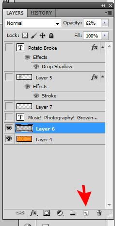
That's not very pretty, now is it? This is where we can change the 'Layer Blend' to get the effect I'm looking for. Click on the drop down menu for that layer. From there you can go through all the different effects to find one you like. I chose Overlay and changed the Opacity until it looked right to me {62%}
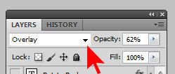
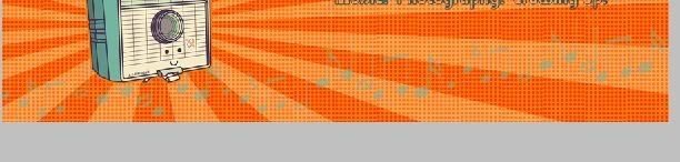
Now we have an pretty awesome background for our header:
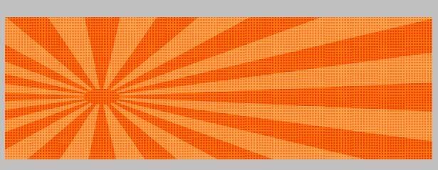
Now I add the Camera Cutout {don't forget to re-size it first}. I wanted it to have a small border around it. I did that by double-clicking on the Camera Layer. That brings up this box:
From there, go to the 'Stroke' section. Check the box AND highlight the box so you can change it to look how you want. You can change the size, opacity, color, and blend mode. One it looks how you want, hit 'OK'.
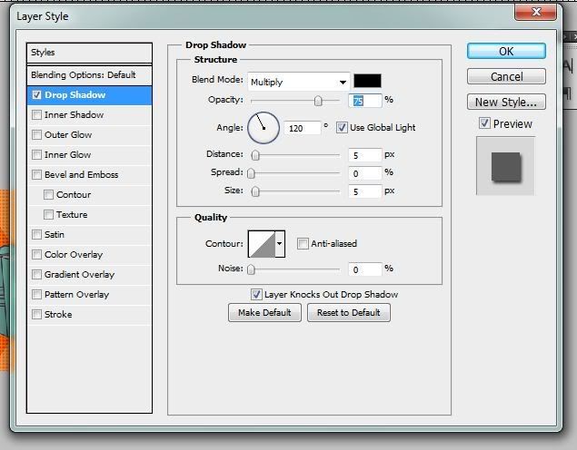
Ready for some text? Use the Type Tool and write your text. Change the font, color, size, etc. until it look how you like. For the main title I used a 'Drop Shadow'. To do this just double-click on your type layer and, again, it will bring up the properties for that layer. Check and highlight the box that says 'Drop Shadow', then play around with it until you like how it looks and hit 'OK'
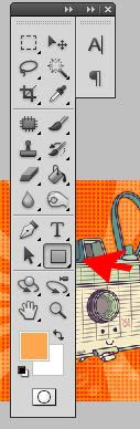
The last thing I added are the music notes at the bottom. I used the 'Custom Shape' Tool and used most of the music note shapes there are and arranged them how I liked.
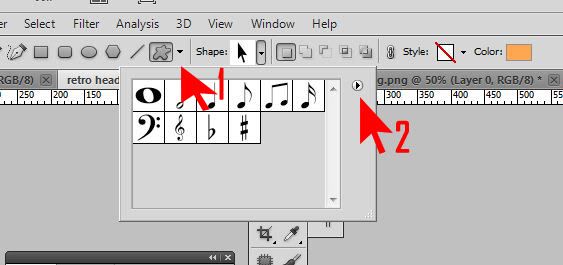
1. Click on the little squiggly circle for custom shapes
2. Click here to see shape categories {you can choose to 'Show All' or only show one category at a time.}
Pick your color and make some shapes! Each shape will be it's own layer and you can add a 'Drop Shadow' or anything you want by double-clicking on that layer.l{like we did previously}
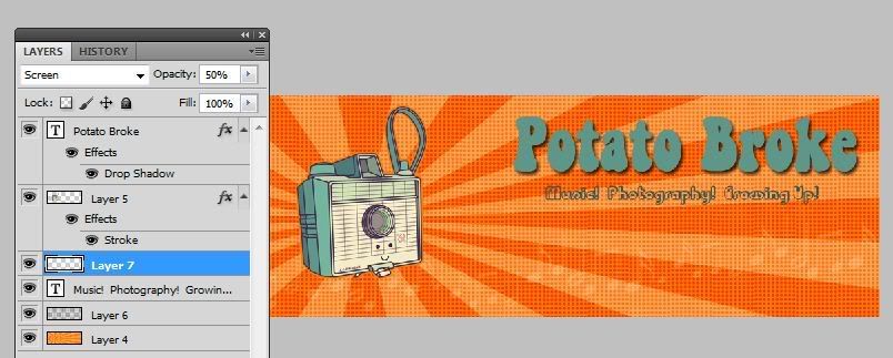
I made them all into one layer, just like I did for the Dots Layer. And changed the 'Blend Mode' to 'Screen' and the 'Opacity' to 50%.
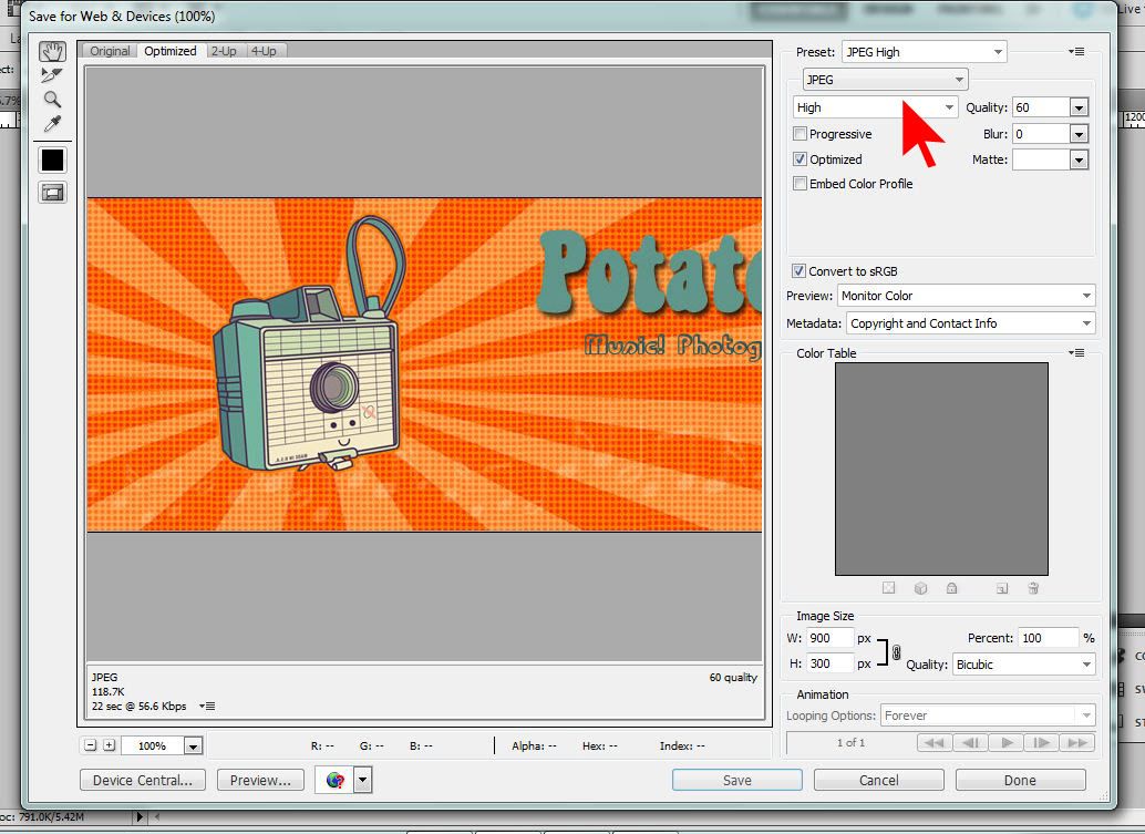
It's ready to save! I always save 2 copies... One that is a .psd file, with all of the layers so in case I want to change any part of t later, I can do so easily. The other I save as a .jpg or .png. This header had no "see through" parts so it wil be fine as a .jpg.
To save the .jpg file that we will use on our blog:
Go to 'Save for Web' and pick JPEG from the drop-down menu. Everything else can stay the same. Hit Save, give it a name and done!
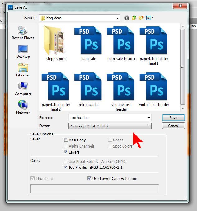
To save it as a .psd, just Go to File > Save As. It should already be in the .psd format, all you have to do is name it.
TaDa! Now you have a super cool custom header!
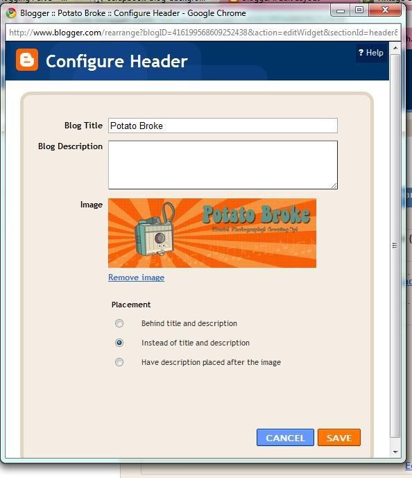
Now that we've done all that work, it's time to add our header to our blog. Go to you blog Design page. On 'Page Elements' you will see your blog layout. Click on Edit for the Header Section:
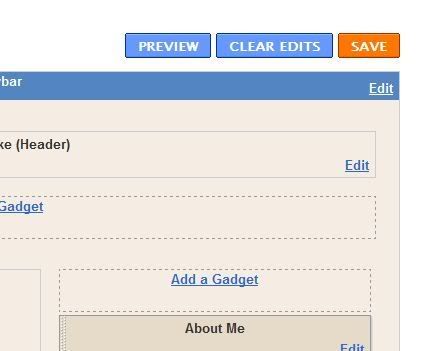
This will pop up:
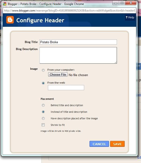
Click 'Choose File' and select you header .jpg file. Make sure 'Instead of title and description' is selected. Hit 'Save' and view your new awesome header on your blog!
Now go try it for yourself.
Thanks for posting this! I'm gonna have to try it out... I'll let you know how it goes! :)
ReplyDeleteGreat tutorial! I went to that website and there are some awesome classes. I think I might sign up for the Illustrator 101 class! There's a blogger class too!
ReplyDelete